I loved the colors of the collection...
...they reminded me a bit of Balenciaga
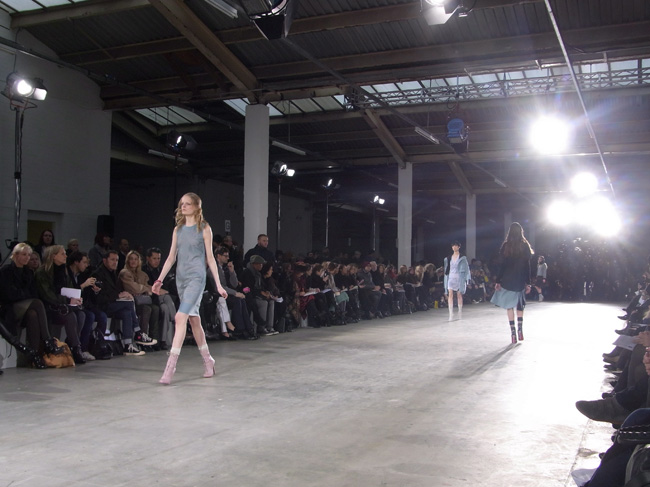
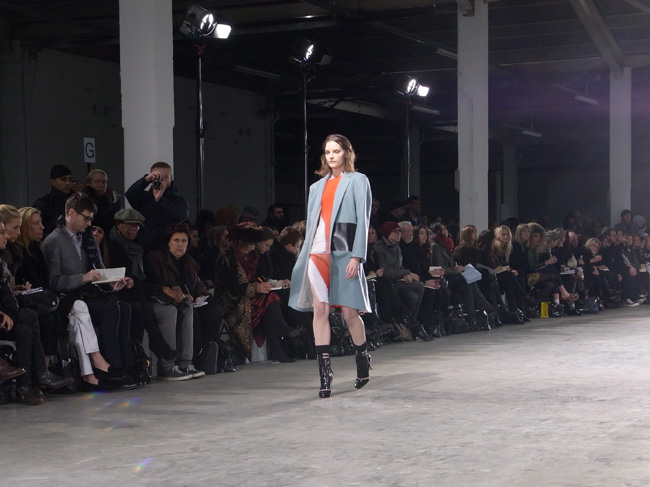
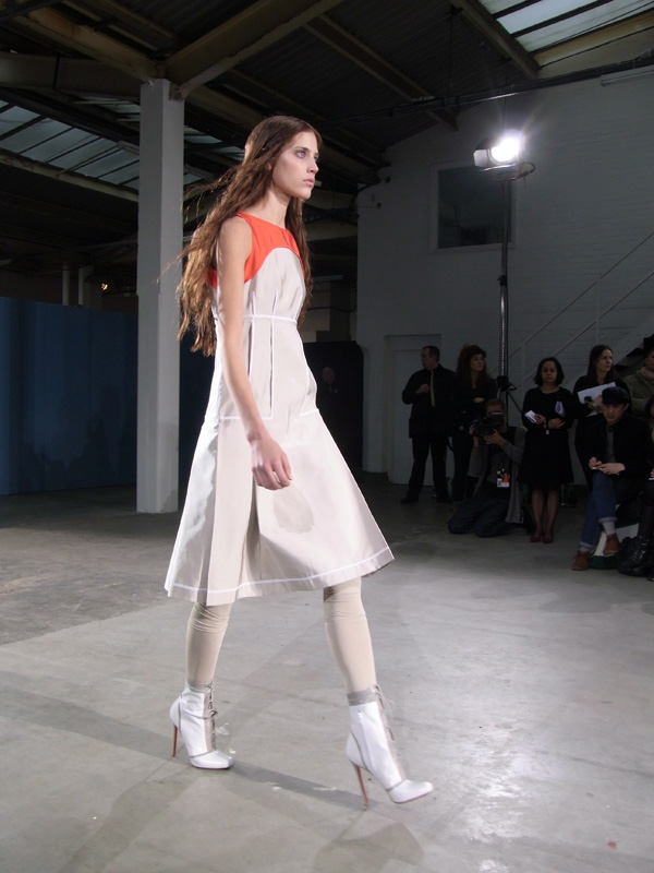
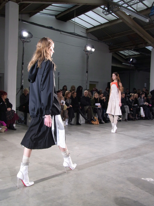
The show took place in a warehouse space in Brick Lane, in a very diaphanous, big, luminous space, the perfect space to show my first collection in a few years (take note Lulu!). And he did it again; by only using blue, orange and black (it remind me a bit of the colour palette Nicholas used for Balenciaga last season), a very street yet posh yet laid back yet classy collection where the colour master (sorry Matthew) showed how he's turning his famous simetrical print signature label into something more casual.
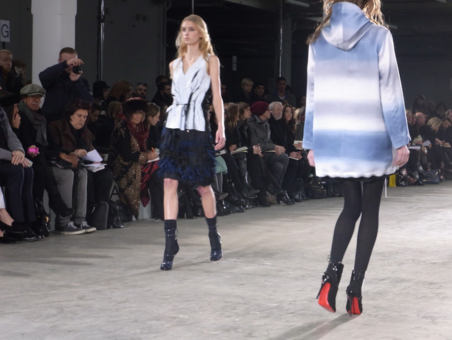
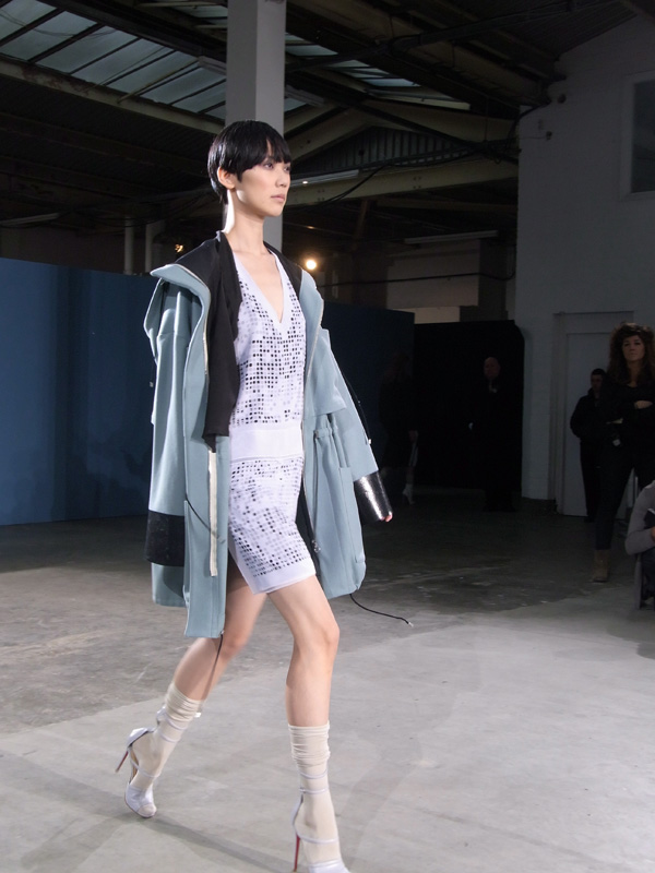
Also, I've noticed Jonathan doesn't like platform shoes
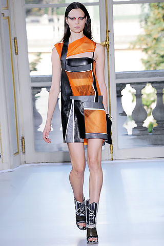
If i were to be a Saunders girl I'd be this one, she looks like
she could kick you ass, love the hoddie
I'm only putting her picture because
she's the new girl on the cover of Tush Magazine
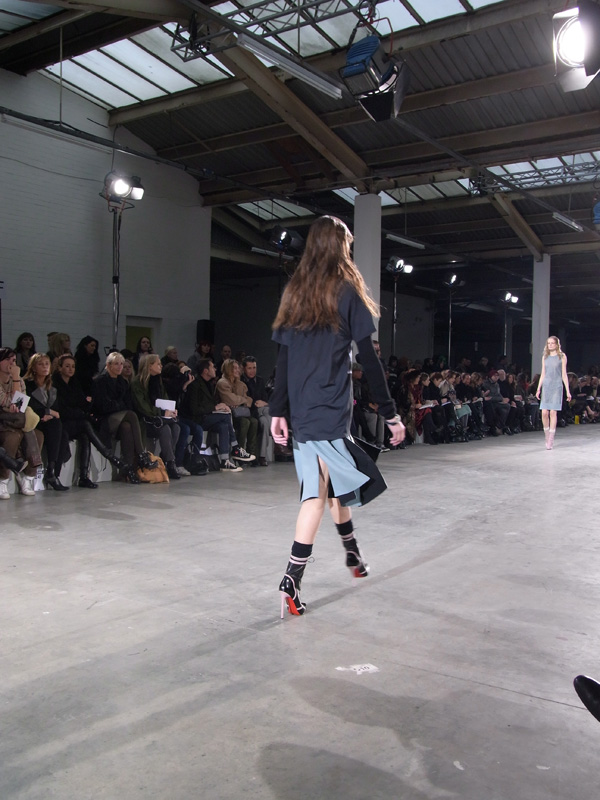
The movement of the skirts with the music was really cool,
see, sometimes is not just a bunch of clothes
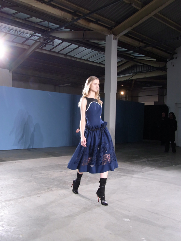
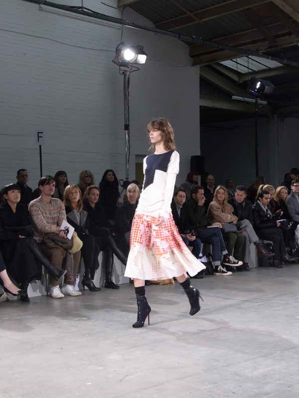
With his previous collection I was already surprised there wasn't prints, just colours, well, this season all we've seen is a rose. I guess Mr Saunders is going back to basics. Somehow -and not just because of the red Louboutin soles giving an extra color- in this show the back of the outfits were for me more interesting than the front.. oh well, good one Jonathan!